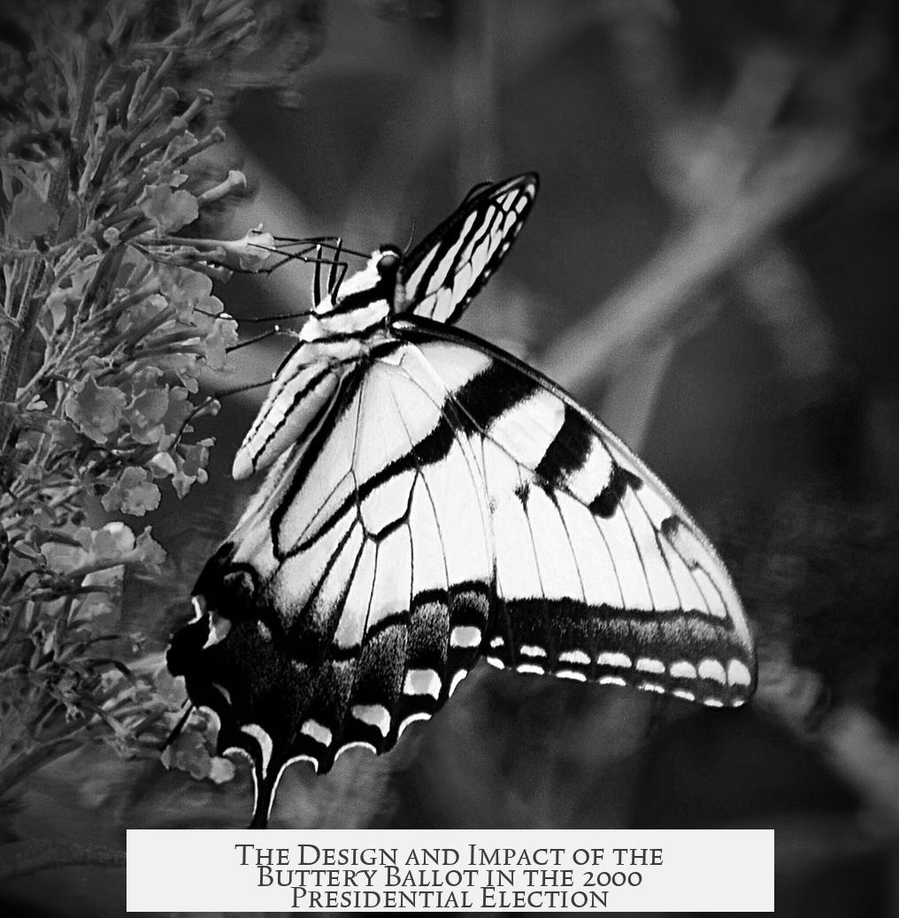
The butterfly ballot in Palm Beach County, Florida, used during the 2000 U.S. Presidential Election, was designed intentionally by Theresa LePore to assist older voters with poor vision. This design aimed to enhance readability by listing candidates in two columns, each on opposite sides of a page that opened like a book. The approach was chosen based on voter demographics and the need for larger font sizes, despite later controversies tied to voter confusion.

Theresa LePore, the Palm Beach County Supervisor of Elections from 1997 to 2005, had extensive experience in election administration since her teenage years. She recognized that nearly a quarter of the county’s population was aged 65 or older. This spurred her to find ways to make ballots more accessible, aligning with state initiatives that increased font sizes on street signs to aid elderly residents. Additionally, she participated in a federal task force focused on improving ballot designs for elderly and disabled voters.
Faced with Florida allowing ten presidential candidates on its ballot that year, LePore considered multiple design options. Instead of cramming names onto a single page with smaller print, she chose a two-page “butterfly” layout with larger text. This decision aimed to reduce strain on voters with limited vision and ensure clarity. She confirmed her intent to prioritize ease of reading in interviews, including a notable one on Good Morning America in December 2000.

LePore did not personally program the ballot into the voting system. That job was completed by Tony Enos, the county’s voting systems manager. Using the BPS system, Enos created several sample ballots over the summer of 2000, from which LePore approved the final two-page butterfly ballot. It was unprecedented in Palm Beach County and was never used again after the election.
The unique design placed candidate names in two columns on either side of the ballot’s center. Voters punched holes through the middle, leading some to confuse the corresponding candidate to their chosen punch hole. This confusion is widely believed to have caused misvotes, contributing to vote disparities in the close election. Political scientists later estimated the butterfly ballot cost Al Gore at least 2,000 votes in the county, exceeding his certified statewide margin of 537 votes.

Public blame for Gore’s loss often focused on LePore and her ballot design, even though her motivations reflected genuine concern for voter accessibility. It is essential to note that other Florida counties also faced ballot design challenges in 2000. For example:
- Duval County used a “caterpillar” style ballot requiring voters to turn pages to view all candidates.
- Both Bush and Gore lost votes there due to overvotes caused by punch errors across pages.
This context highlights that Palm Beach County’s butterfly ballot was part of broader ballot design struggles in Florida. These systemic issues contributed significantly to the election’s difficulties.

Key points to consider:
- Theresa LePore designed the butterfly ballot to assist older voters with poor vision by using a two-page layout with larger fonts.
- The design placed candidate names in two columns flanking a punch center, which caused confusion for some voters.
- LePore was influenced by demographic data and prior experience with ballot improvement efforts for elderly and disabled voters.
- The butterfly ballot was new for Palm Beach County in 2000 and discontinued afterward due to its controversial impact.
- Political scientists estimate this design may have cost Al Gore thousands of votes in the county.
- Other counties in Florida experienced unique ballot issues in the same election, pointing to broader systemic challenges.
Do We Know How the “Butterfly Ballot” in Palm Beach County, Florida, for the 2000 USA Presidential Election, Ended Up Being Designed the Way It Was?

Yes, we do. The design of the infamous Butterfly Ballot in Palm Beach County was a deliberate decision driven by voter accommodation, specifically targeting older residents with poor vision. Theresa LePore, Palm Beach County’s Supervisor of Elections from 1997 to 2005, spearheaded this design with earnest intention but unexpected consequences.
Let’s unpack this fascinating slice of electoral history together. It’s a tale of good intentions tangled in execution, technical details, and electoral chaos—served with a side of mild voter confusion.

The Origin Story: A Design Born out of Empathy
Theresa LePore wasn’t a novice who stumbled upon ballot design. She had been deeply involved in election administration since she was 15 years old, earning a seasoned perspective on voter needs. By the year 2000, Palm Beach County had nearly 25% of its population aged 65 or older. These voters often faced challenges like poor eyesight. Prior state initiatives had even increased font sizes on street signs to boost safety for older drivers.

LePore’s personal involvement in a federal task force researching ballot improvements for elderly and disabled voters deeply influenced her approach. Inspired by this work, she aimed to prioritize readability and navigation over any other concerns. The result? The “butterfly” ballot, named for its two-page spread resembling butterfly wings when opened.
In her own words during a December 2000 Good Morning America interview, she explained: “I was trying to make the ballot so that it would be easier for the voters to read, which is why we went to the two-page, now known as the butterfly ballot.”
The Mechanics of the Butterfly Ballot: Elegance Meets Confusion
This ballot design had candidate names listed in two columns on opposite sides, opening like a book. Voters would punch holes to the center of the ballot near their chosen candidate’s name. The problem? Figuring out which punch hole corresponded to which candidate was notoriously tricky. The two-column structure spread over a fold made it hard to map names to punch holes intuitively.
What sounds like a brilliant solution to improve font size and readability ended up entangling voters in a puzzle reminiscent of a treasure map—except the treasure was their vote, and the stakes were a lot higher.
Behind the Curtain: How Was This Design Chosen?
During planning, LePore and her team faced a unique challenge: Florida allowed 10 presidential candidates on the ballot that year. Fitting all their names legibly on a single page without confusing font shrinks and patient navigation was a tall order.
LePore explored a variety of other designs. However, she eventually decided that prioritizing the needs of elderly voters—those with poor vision—was paramount, even at the risk of introducing some confusion. The butterfly layout helped reduce eye strain through a larger font and no cramped, tiny text. Despite the risks, the design was given her official stamp of approval.
It’s essential to note that while LePore made the key design decisions, she did not enter the ballot data herself. That responsibility fell to Tony Enos, the voting systems manager, who implemented the design in the county’s BPS (Ballot Programming System) during summer 2000. This ballot style was new for Palm Beach County—it was never used before or after 2000.
A Design With Consequences: The Butterfly Ballot’s Role in the Election Outcome
The butterfly ballot quickly earned a notorious reputation. Its confusing layout caused many voters to select the wrong punch hole by mistake. In particular, it is widely believed that some who intended to vote for Al Gore inadvertently punched the hole for Pat Buchanan, who was listed further down but aligned oddly.
According to an American Political Science Review article published in December 2001, political scientists estimated that this confusing design cost Gore at least 2,000 votes just in Palm Beach County. That’s significant because the certified loss margin he faced in Florida was only 537 votes. This discrepancy sparked intense scrutiny, lawsuits, and a nationwide debate about ballot design and election fairness.
So yes, the design became a scapegoat of sorts. LePore’s well-intended choice contributed to voter confusion that may have altered one of the most closely contested presidential elections in recent history.
Butterflies Aren’t the Only Confusing Design: Context Matters
It wasn’t just Palm Beach County that faced trouble. Other Florida counties like Duval County—home to Jacksonville—also struggled with ballot designs. Their “caterpillar” ballot spread candidates over two pages, forcing voters to flip through to find their choice for president. This resulted in overvotes—where voters unintentionally selected multiple candidates—and many discarded presidential votes.
Election officials nationwide learned hard lessons from these chaotic ballot designs. Clunky layouts, whether butterfly, caterpillar, or other creatively named ballots, aren’t just quirky—they carry the risk of disenfranchisement.
What Can Be Learned From the Butterfly Ballot Debacle?
First, intention isn’t enough. Theresa LePore’s goal to accommodate elderly voters with legibility was noble and rooted in experience. However, ease of reading doesn’t equal ease of voting. Ballot usability must balance clarity with unambiguous navigation.
Second, user testing and wide consultation matter. If a dozen voters face confusion, that’s already a problem. Thousands? That’s a crisis. While LePore and her federal task force had researched elderly voters’ needs, it’s unclear how much real-world user testing happened with the actual butterfly design before election day.
Third, context is king. Florida allowing 10 candidates forced design compromises. Understanding constraints and alternatives could have prompted an innovation balancing both legibility and intuitive layout—maybe a longer single-page format or better instructions.
Lastly, precise data entry and layout verification count. Tony Enos’ role in translating the design into the paper ballot was critical. Any mismatch between design intent and implementation could amplify confusion.
Personal Takeaway: Balancing Accessibility and Simplicity in Voting
Imagine walking into a polling place on November 7, 2000, geometry and logic in hand, only to face a ballot that seemed to play tricks. It’s no wonder thousands hesitated or erred. I find the butterfly ballot story a powerful reminder: accessibility isn’t just about making things bigger. It’s about making processes smoother, clearer—even if it means thinking outside the metaphorical “book.”
Voters deserve ballots that speak their language—simple instructions, clear layout, and no guesswork. Hopefully, election officials today heed the butterfly’s mixed legacy and prioritize transparency and ease for all voters, regardless of age or vision.
Final Thoughts
So, yes, we definitely know how the butterfly ballot came into existence. It was Theresa LePore’s well-meaning effort to accommodate older Palm Beach County voters facing vision challenges. The design employed a unique two-page layout to increase font size and readability. Despite thorough backgrounds and federal taskforce insights, this design created confusion in matching punch holes to candidates, arguably influencing the 2000 presidential election outcome.
Palm Beach County never used the butterfly ballot before or after 2000, underscoring the significant consequences such designs can have when user experience is underestimated. Election systems now actively incorporate lessons from this episode—aiming for accessible, intuitive ballots that truly empower voters.
Next time you fill out a ballot, spare a thought for the butterfly—whose flutter still echoes in the politics of design clarity and democratic fairness.