Pastel colors, especially turquoise and pink, gained popularity in the 1950s largely due to a continuation of earlier color preferences and the impact of emerging film technology. The assumption that these colors suddenly dominated after World War II is misleading. In fact, light and pastel colors were already fashionable during the 1930s and 1940s, reflecting a gradual evolution rather than a sharp break.
During the 1950s, pastel tones appeared prominently in fashion, interior design, and consumer products. This popularity stems from cultural and technological factors. The rise of color films in the 1950s helped showcase the vibrancy and appeal of pastels. In contrast, black-and-white films from the 1940s distorted how audiences perceived color, influencing their impressions inaccurately.
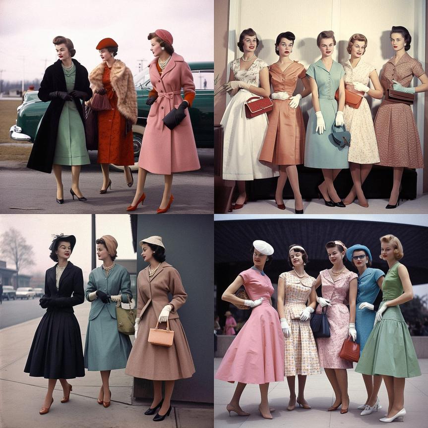
Historical evidence from fashion magazines of the 1930s and 1940s confirms the use of pastels like turquoise and pink well before the 1950s. These colors complemented the lighter, optimistic post-war mood. At the same time, clothing styles often employed bold patterns, showing that pastels did not exclude vibrant design elements.
The continuation of pastel popularity fits a broader trend toward light and fresh tones that contrasted with the darker, more muted colors common during wartime. Pastels also aligned with the domestic ideals of the 1950s, symbolizing calm and comfort in household environments and fashion.
| Factor | Explanation |
|---|---|
| Preexisting Popularity | Pastels were already favored in the 1930s and 1940s. |
| Film Technology | Color films highlighted pastels vividly, shaping tastes. |
| Cultural Mood | Post-war optimism supported lighter, comforting colors. |
| Fashion Trends | Bold patterns combined with pastel bases characterized styles. |
The popularity of turquoise and pink in the 1950s represents a blend of ongoing color trends and new visual media influences rather than a sudden fashion revolution.
- 1950s pastel popularity continued from earlier decades.
- Color films enhanced the appeal of shades like turquoise and pink.
- Pastels evoked optimism after wartime austerity.
- Fashion mixed pastels with bold patterns for distinctive looks.
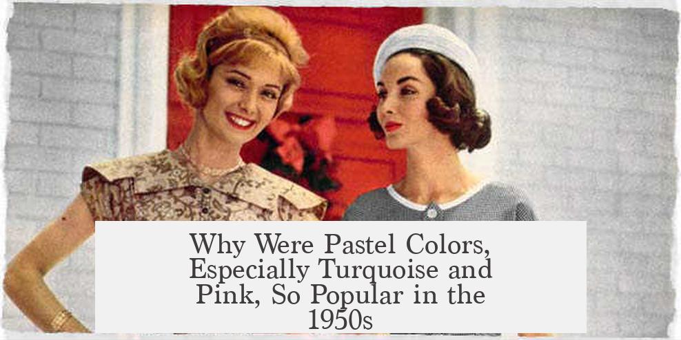
Why Were Pastel Colors, Especially Turquoise and Pink, So Popular in the 1950s?
Pastel colors like turquoise and pink did not suddenly burst onto the scene in the 1950s; instead, their popularity is part of a steady and ongoing trend that stretches back at least to the 1930s and 1940s. The idea that these soft hues became fashionable only after World War II is a common misconception, but it misses the bigger picture shaped by continuity and visual perception.
So, why do we *think* pastels, particularly turquoise and pink, define the ’50s style? It is partly because of how we *see* the era and partly because those colors perfectly matched the optimistic mood of postwar America.
Confused already? Let’s untangle this colorful web.
The Myth of a Sharp Postwar Shift
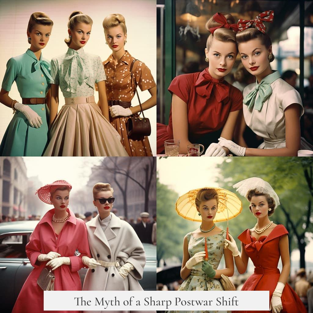
A lot of people imagine that during the war, colors were bold, dramatic, and utilitarian while the ’50s introduced a pastel explosion as if someone flipped a switch. Spoiler alert: that’s not quite how it went down.
Research shows there wasn’t a radical shift from bold colors during the war to pastels afterward. In fact, light and pastel colors had already been popular through the late 1930s and 1940s. Fashion magazines and patterns from those decades reveal a spectrum rich with soft hues, including turquoise and pink.
We like simple stories, but this one is more of a steady gradient than a sharp line.
The Black-and-White Film Effect
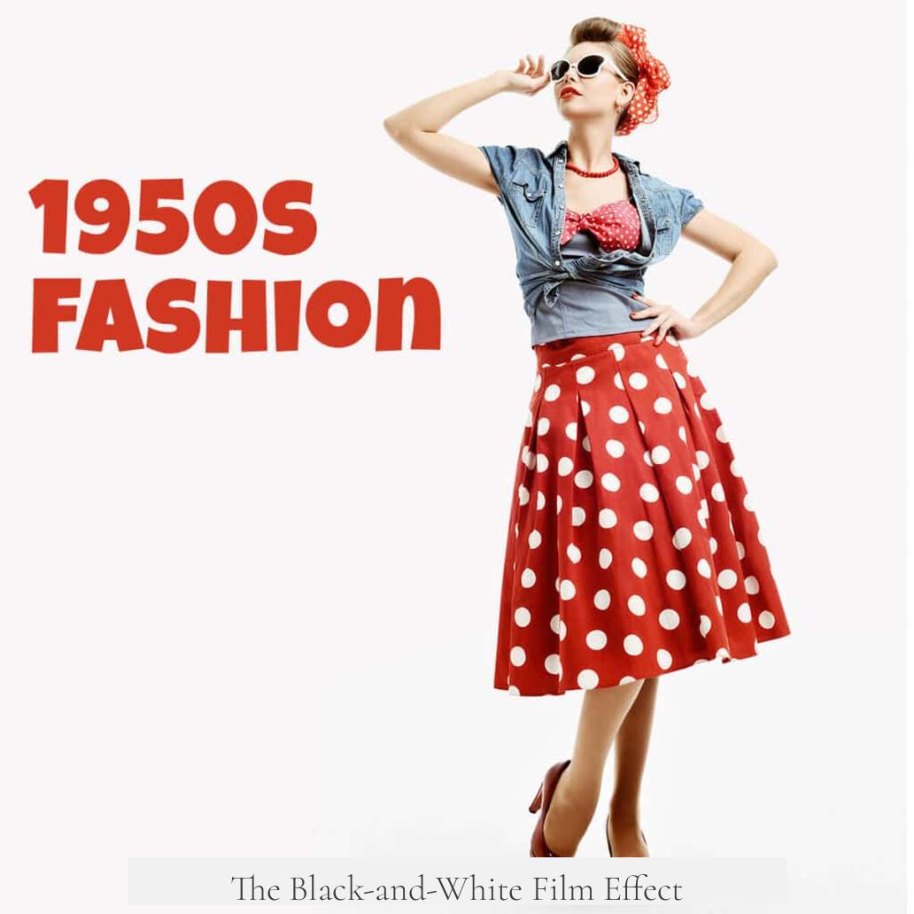
Here’s a fun twist: our perception of color trends is distorted by the technology of the time. The 1940s were dominated by black-and-white films, making it hard to imagine just how colorful everything was. Come the 1950s, the rise of vividly colored movies gave these pastels a spotlight.
“Color on screen can trick the mind. Subtle shades look dazzling once they escape the grayscale.”
So, it’s not that pastel clothing and décor suddenly flooded the market, but that vivid color film emphasized what had already been present. It’s a bit like walking around a room in dim light and suddenly switching on the lights—what was always there feels brand new.
Turquoise and Pink: The Perfect Pairing
Why turquoise and pink specifically? These colors resonated with the optimistic, hopeful mood after years of war and hardship. Turquoise evokes calmness and clarity, while pink adds warmth and softness, projecting a vision of comfort and prosperity.
Household appliances, cars, kitchens, and living rooms soon glowed with these shades. Turquoise refrigerators and pastel pink stoves became signature icons of the 1950s suburban dream.
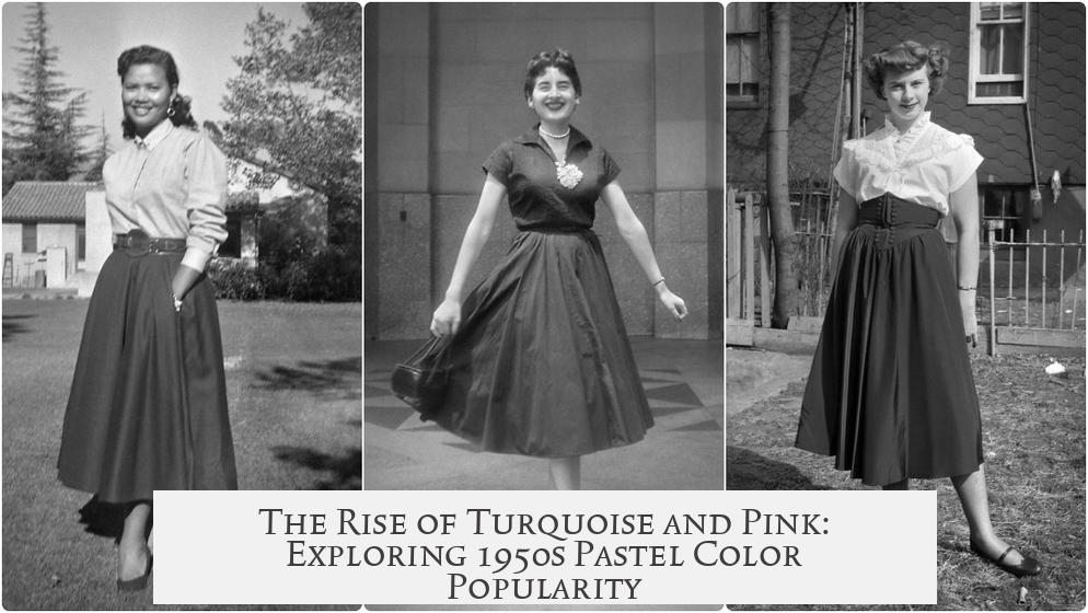
1950s Fashion: Pastels and Bold Patterns Coexist
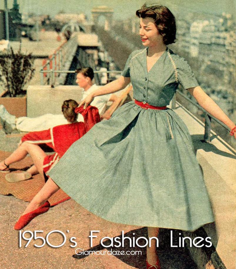
While pastels are often the star of the show, 1950s fashion wasn’t a pastel-only party. Bold patterns thrived alongside soft colors. Think polka dots, florals, and geometric shapes complementing those gentle hues, creating clothes that were visually exciting but balanced.
The result? A decade bursting with personality, color, and style variety. Pastel colors provided a soft canvas, while bold patterns painted on flair and confidence.
Continuity: Pastels Aren’t Just a 1950s Fad
Knowing that turquoise and pink were already fashionable in earlier decades changes the story. It suggests the ’50s didn’t invent the palette; they *cemented* it as a symbol of a particular cultural moment.
This perspective helps explain why those soft colors feel so tied to the decade but also connects them to a longer history of style evolution.
What Can We Learn From This Colorful History?
- Don’t trust simplistic “before and after” narratives about trends. Colors fade and return in cycles.
- Understand how media technology shapes our memory and perception of styles.
- Recognize that color choice reflects mood and values—pastels mirror peace and optimism.
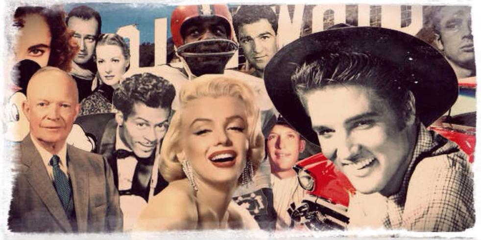
Next time you see a turquoise diner or a pink Cadillac, remember: they are part of a rich, continuous story, not just a sudden ’50s trend. And that story reminds us about how culture, technology, and psychology all mix up in our favorite designs.
Could it be that we still crave those optimistic pastel vibes today? Maybe turquoise and pink are hanging around longer than you thought. Why not add a little pastel to your life and see how it brightens your day?